- Branding
- Logos
- UI/UX Design
- About Me
Personal Project 2
Sun Screen Packaging
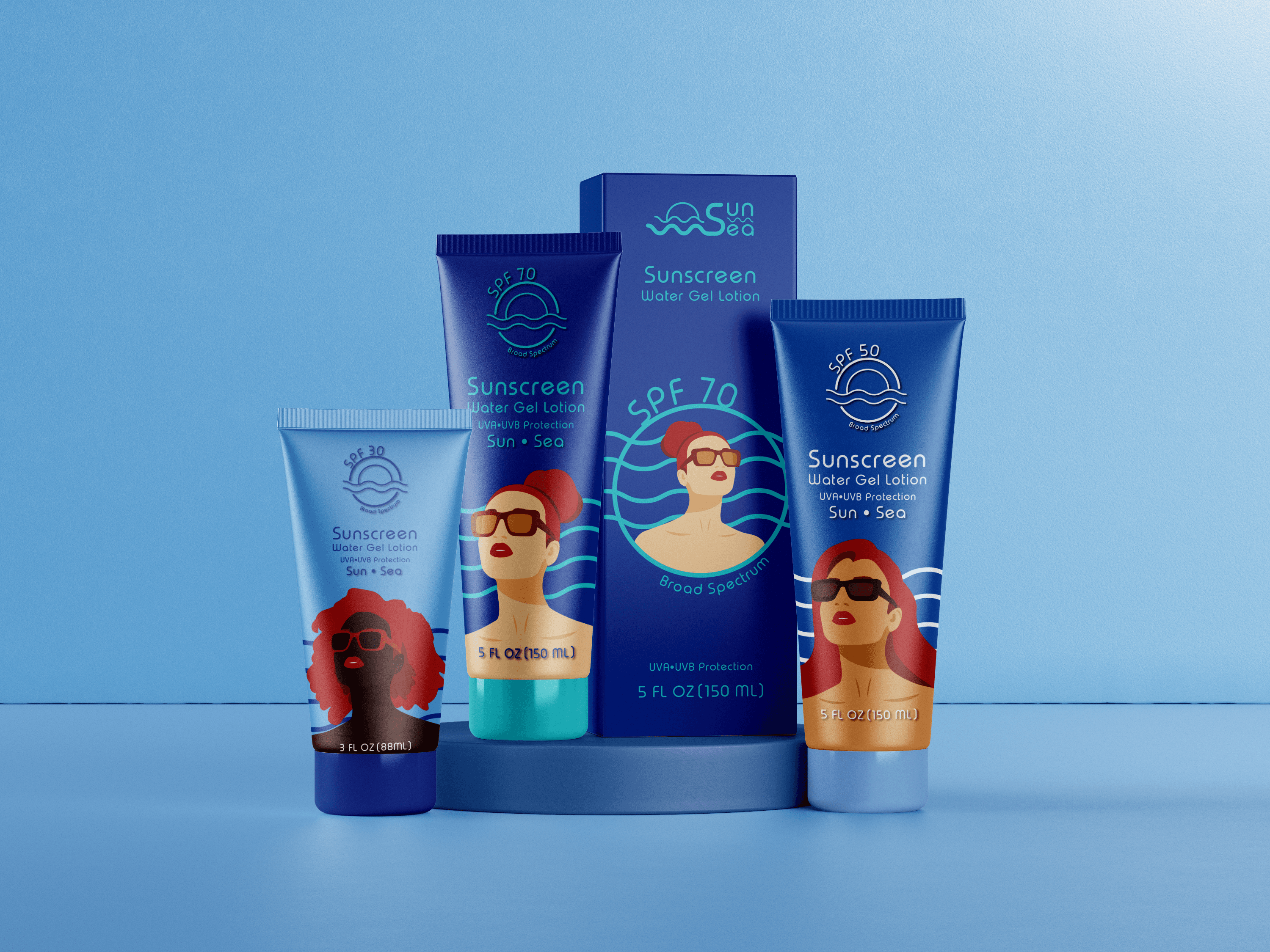
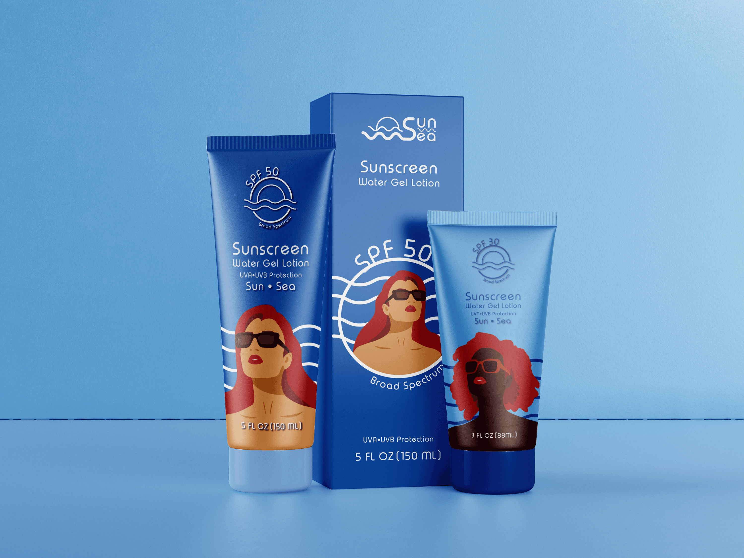
'Sun Sea' is a personal project of mine aimed at serving the beauty and skincare industry. The primary objective is to translate the brand personality into a compelling identity that embodies femininity, simplicity, youthfulness, and premium natural ingredients. For the logo, I selected a typeface that strikes a balance between dynamism, modernity, and familiarity.This flexibility ensures that 'Sun Sea' remains relevant across all visual communication platforms. This coherent identity solidifies 'Sun Sea's' standing as a provider of high-quality, natural, and appealing products, resonating with the target audience. The simplification ethos extends to the product packaging line of 'Sun Sea', which is based on typography-style design. This strategy facilitates a clear and simple connection with our target demographic.
Sun Screen Concept Design
'Sun Sea'
Logo and Illustration









Packaging Illustration
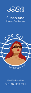
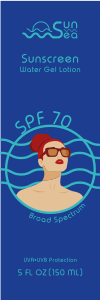
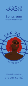
Packaging