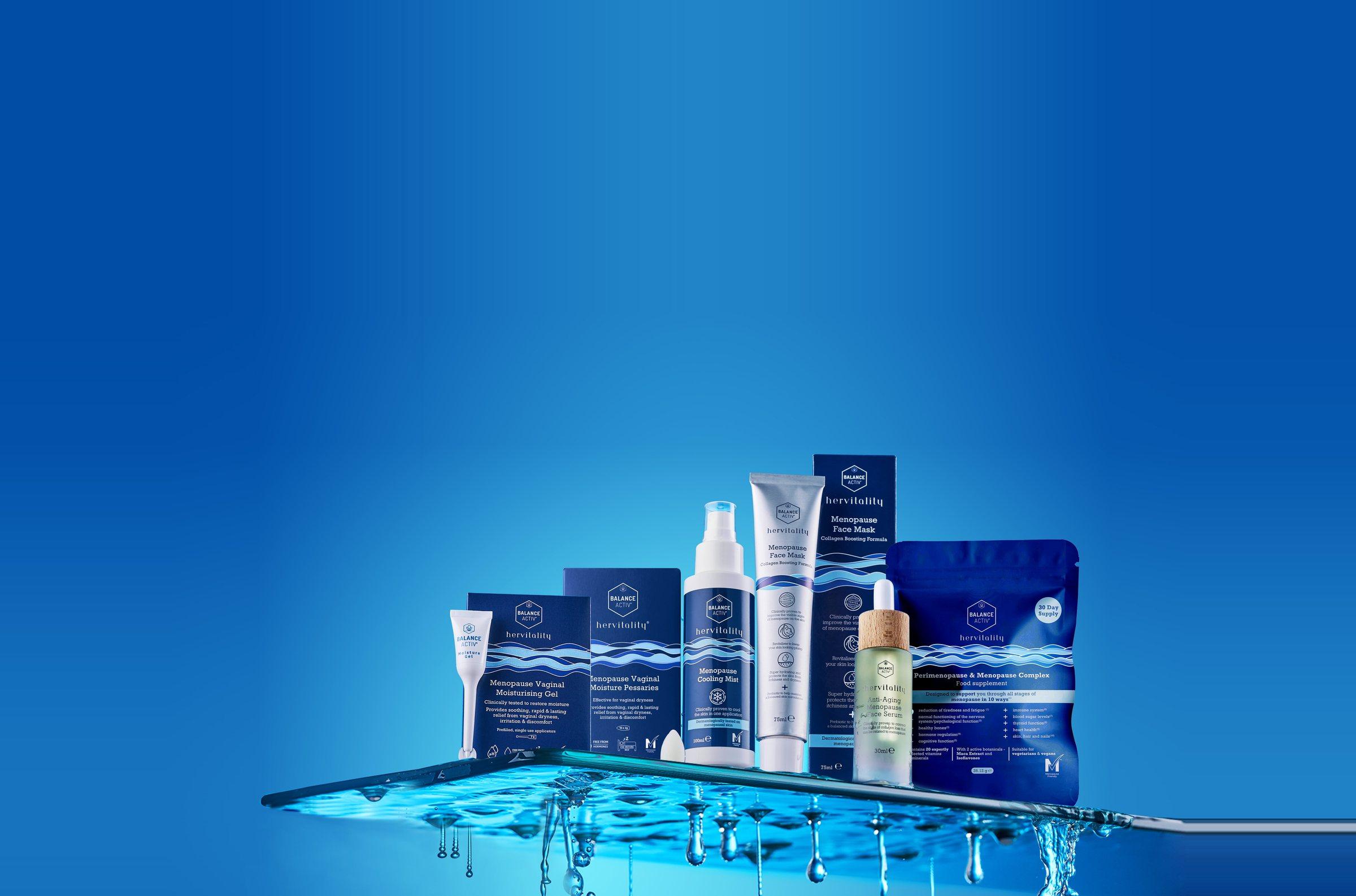
Menopause solutions
without the hormones
Brand identity for a menopause skincare range. A calm, clinical look for every phase of the journey.
Brand identityHervitality, 2026
The identity is built on the contrast between calm and storm, reflecting the changing experience of menopause. Deep navy gives the range strength on a shelf of soft pastels, while the flowing wave brings balance and movement, from the bottle to the box to the screen.
Deep at the base, Light & Calm at the surface
The palette comes from a single body of water: a deep navy at the base, a medium blue through the middle and a pale blue at the surface, with paper white for inversions. Together they read as clinical and reassuring where the category usually reaches for pink.
Task
To build a visual identity for a menopause skincare and supplement range that feels clinical and calm at once: a wordmark, a colour system and a wave graphic that run from packaging to digital and retail, and give the range strength on a shelf full of soft pastels.
Client
Hervitality
Industry
skincare, menopause wellness
Year
2026
Deliverables
Brand identity
Wordmark
Colour system
Packaging graphics
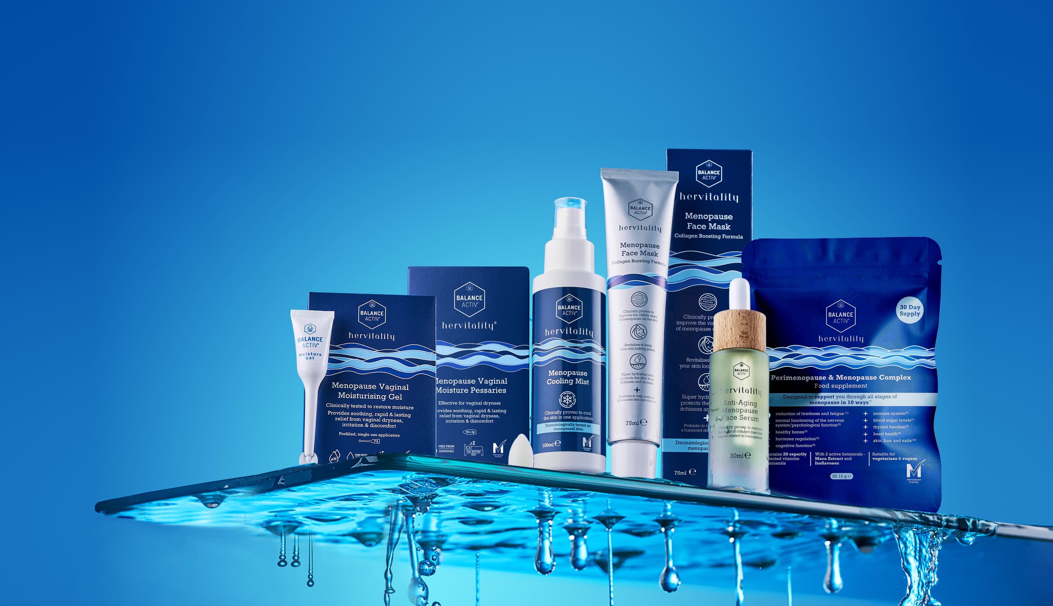
Introducing Hervitality products
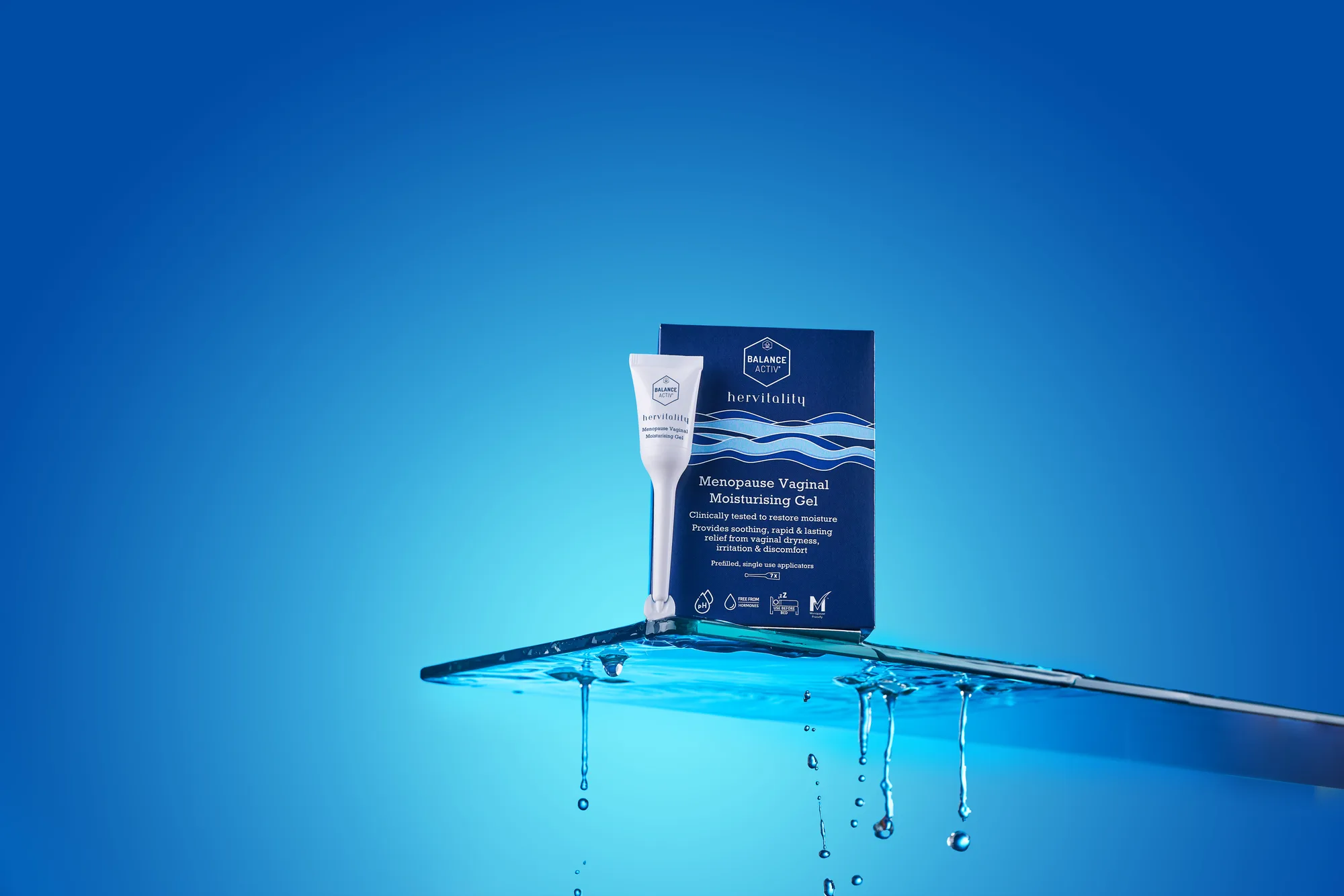
Menopause Vaginal
Moisturising Gel
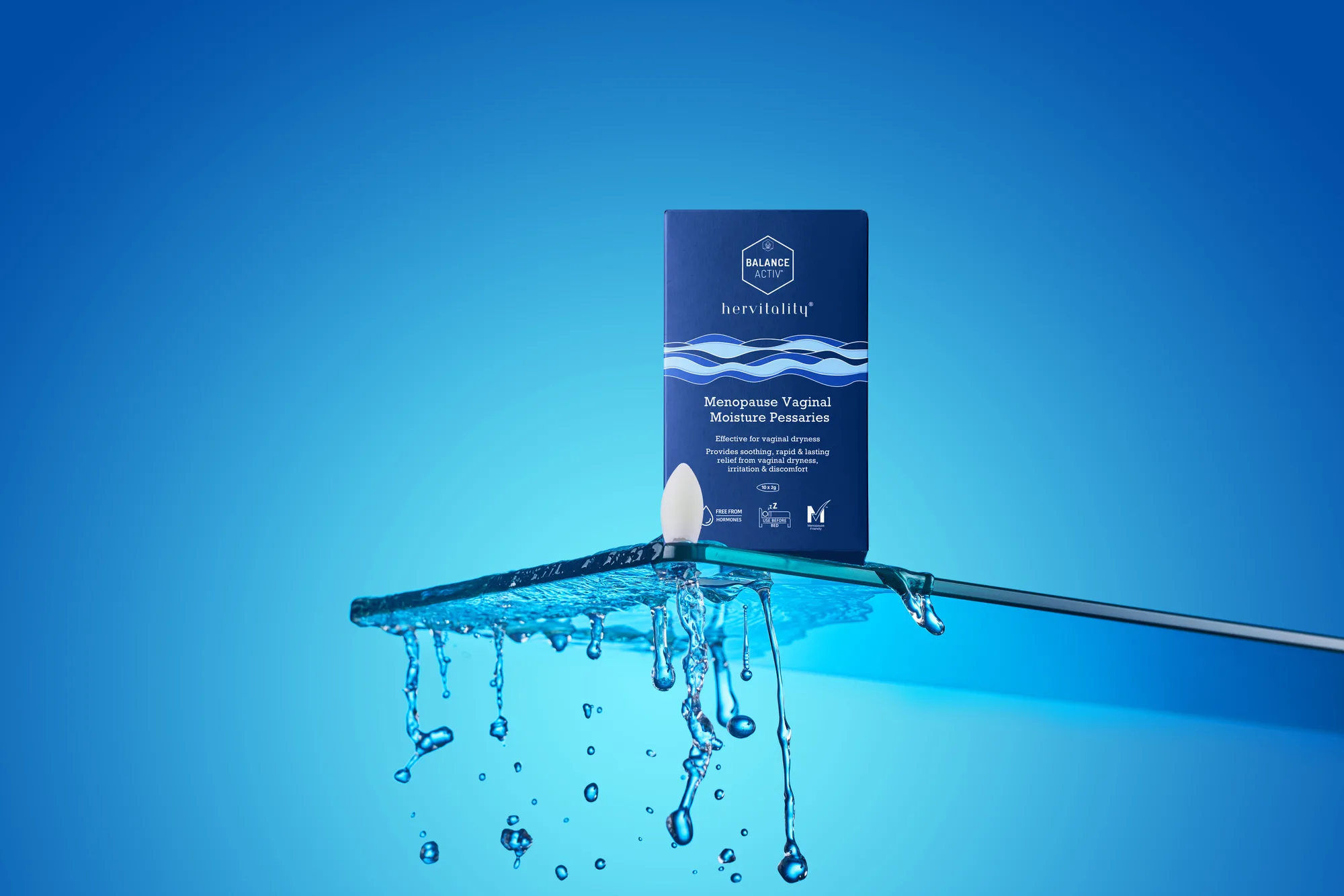
Menopause Vaginal
Moisture Pessaries
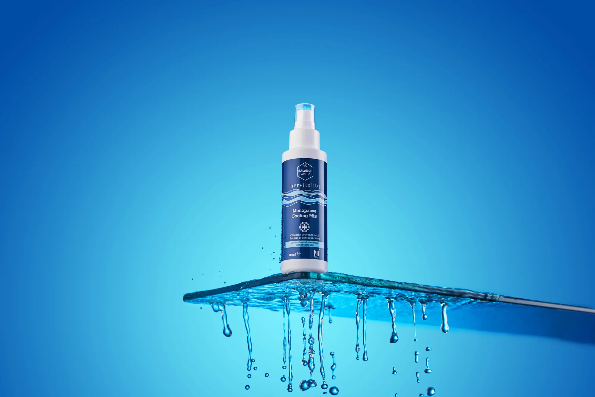
Menopause
Cooling Mist
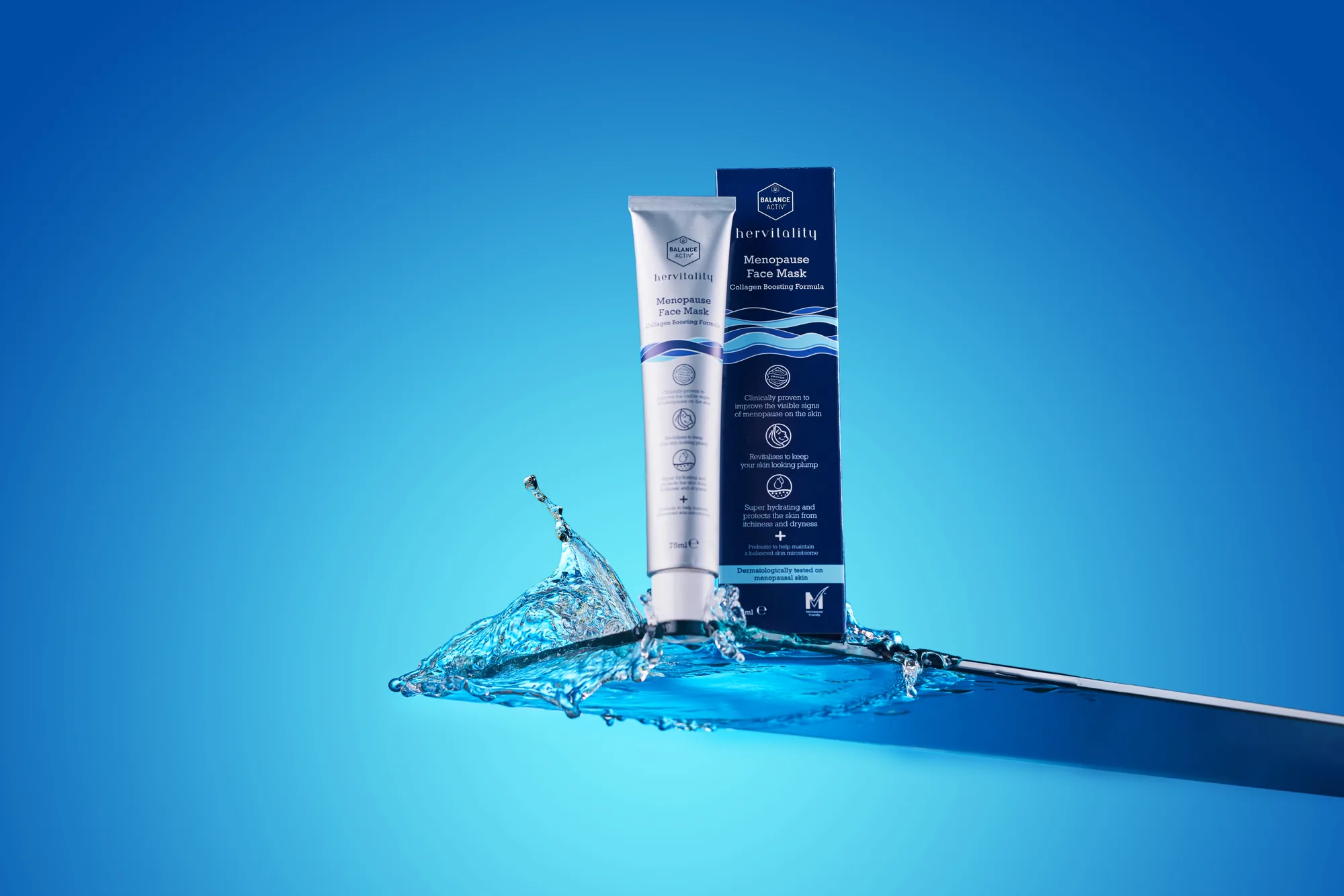
Menopause
Face Mask
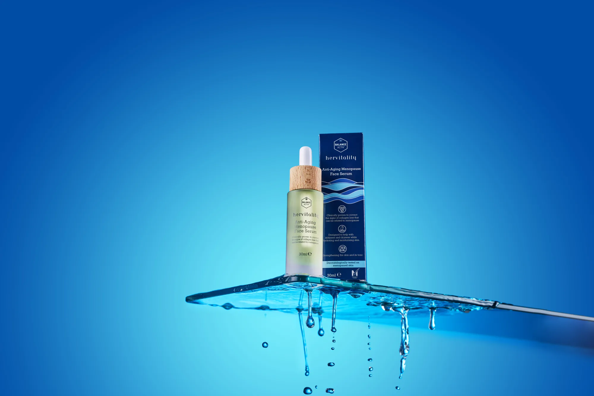
Anti-Aging Menopause
Face Serum
Deep at the base, light at the surface: an identity built on the calm of slow water.
The concept
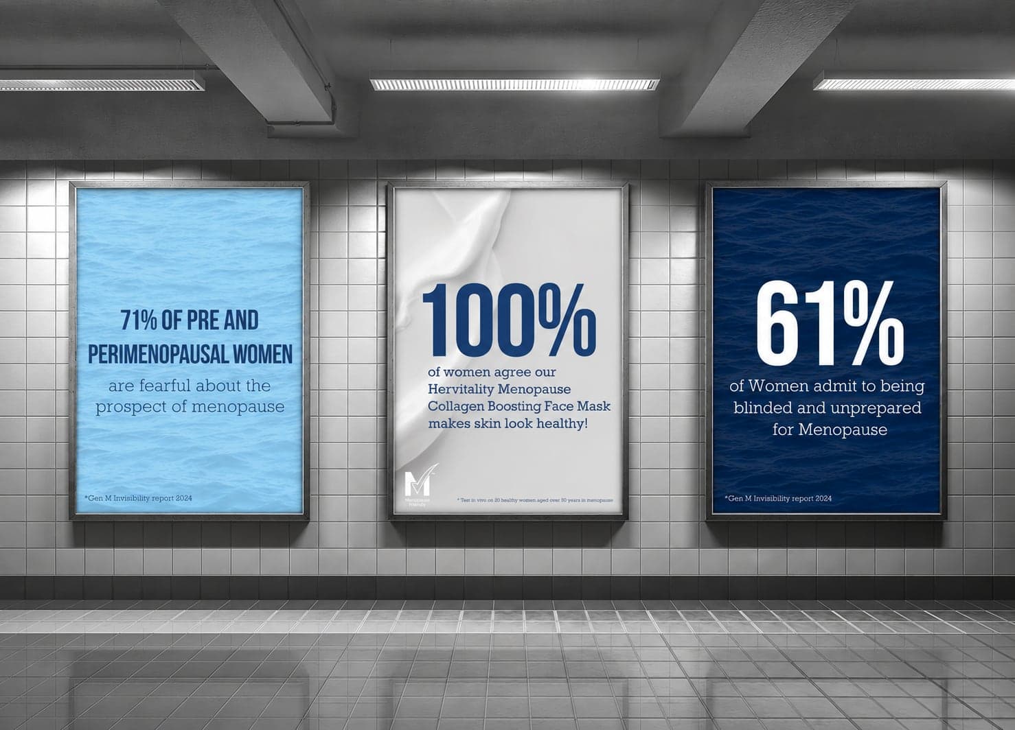
The identity is built on the contrast between calm and storm, reflecting the changing experience of menopause. Deep navy tones give the range strength and shelf presence in a category dominated by soft pastels, while the flowing wave graphic brings balance and movement. The system flexes across every touchpoint, so one visual language runs through packaging, digital content and retail from day one.
Typography
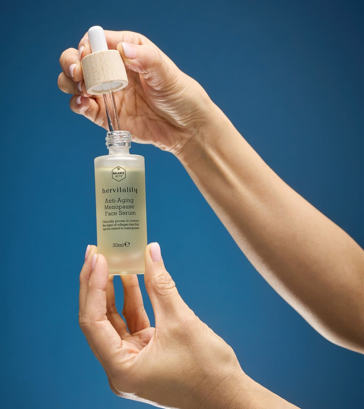
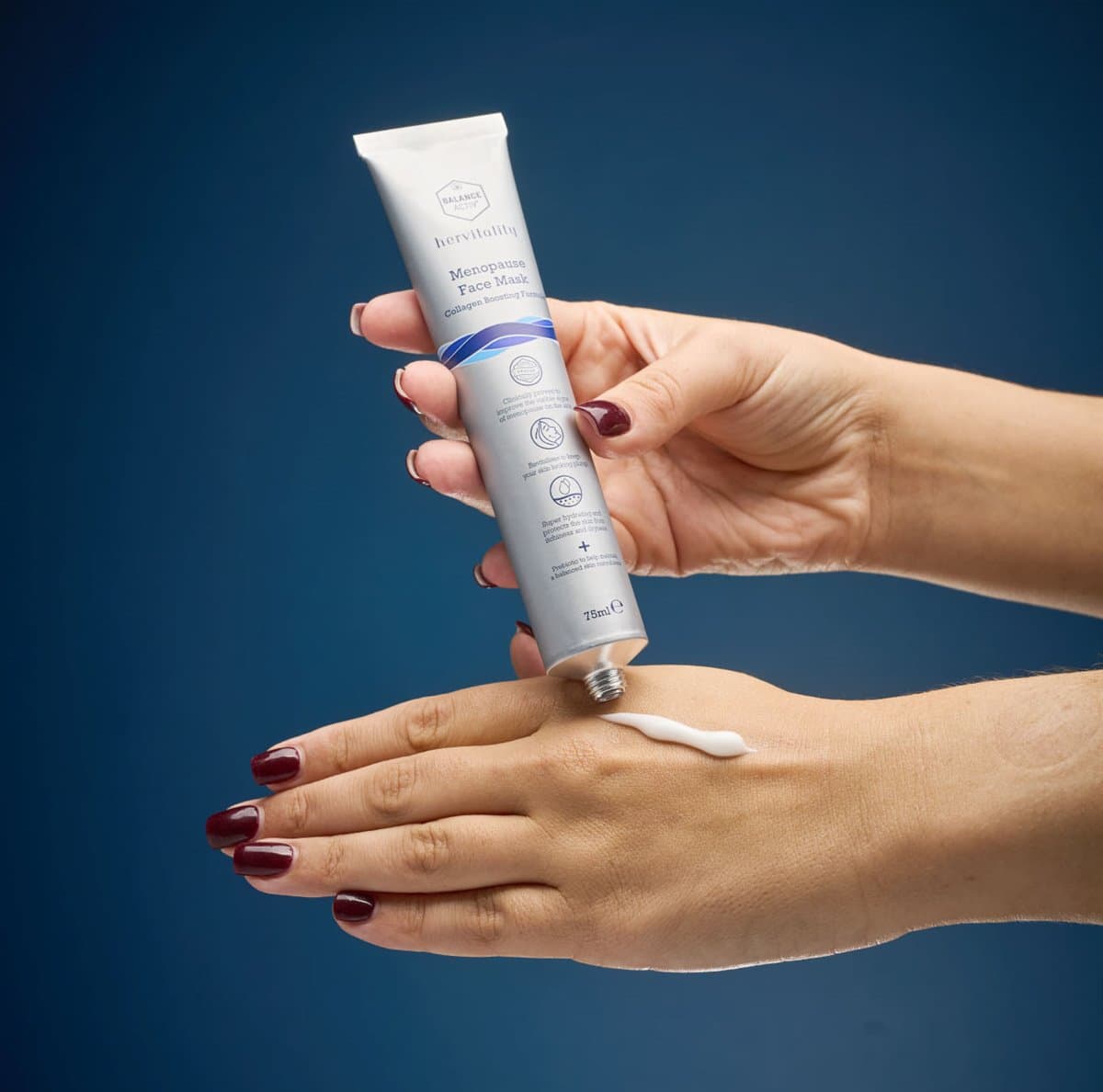
The wordmark is set in a low, wide grotesk with open counters, so it stays legible on a small serum bottle and calm at poster size. Inter carries the body text and the supporting identity elements.

Colour
The palette comes from a single body of water: a deep navy at the base, a medium blue through the middle and a pale blue at the surface, with paper white for inversions. Together they read as clinical and reassuring where the category usually reaches for pink.
- PANTONE
- 2767 C
- RGB
- 24 61 111
- CMYK
- 100 69 16 52
- HEX
- 183D6F
- PANTONE
- 2707 C
- RGB
- 168 200 240
- CMYK
- 38 12 11 1
- HEX
- A8C8F0
- PANTONE
- 7683 C
- RGB
- 55 84 153
- CMYK
- 61 31 19 10
- HEX
- 375499
- PANTONE
- 11-4001 TPG
- RGB
- 244 246 250
- CMYK
- 3 1 0 0
- HEX
- F4F6FA
ocean of possibilities
“like the waves, keep moving forward.
Embrace the calm, power through the storm.
Each day is a new horizon.”
Like the waves, the range keeps moving: the same graphic rolls from the bottle to the box to the screen.
Brand identity
Wordmark, colours and the wave become the range’s packaging: the serum and the mask share one navy ground, the wave band marks the product, and the pale blue lifts the supplements. Everything that follows, from the new-item email to the retail cards, is set from the same few parts.
In motion
The identity on the brand’s social channels: the wave, the navy and the pale blue carry the same calm into a vertical edit for Instagram and TikTok.